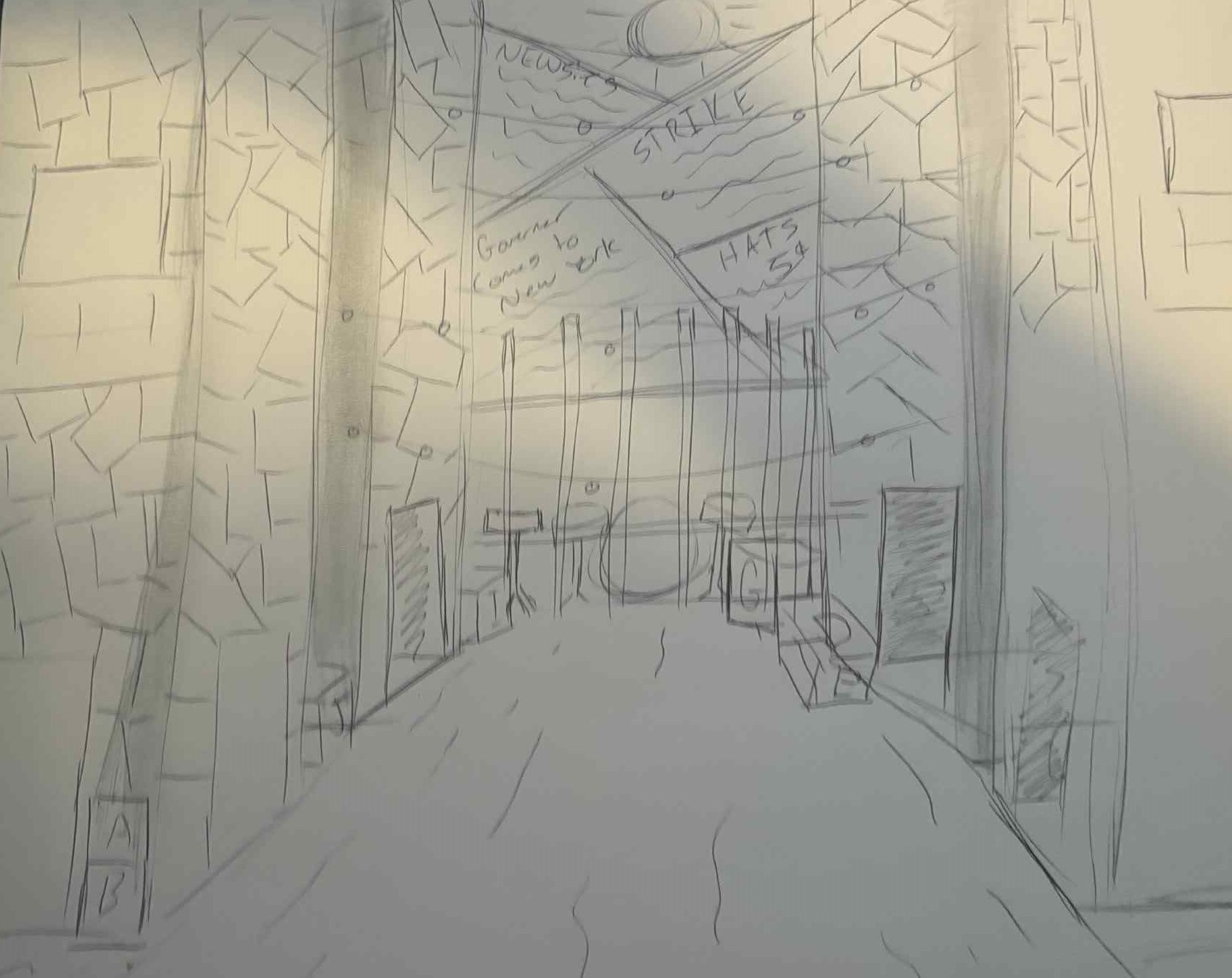
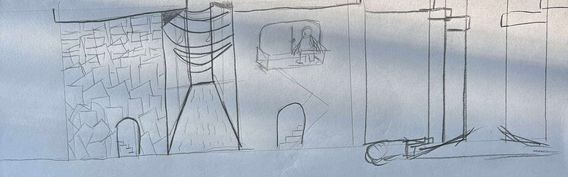
The original concept for newsies was going to be an alleyway. almost a split down the middle, one side was the seedy and dirty side of new York where the newsies resided and the other half was where the powerful and elite lived. A dirt road down the middle would be used almost as a runway for entrances and exits for all cast and be an arrow pointing at the band that the audience could see all the time. The buildings would be flats that created depth so that folks could enter from different distances from down stage for variety sake. this design concept would end up not being the final choice as it left the production team worried about options for song and dance numbers.
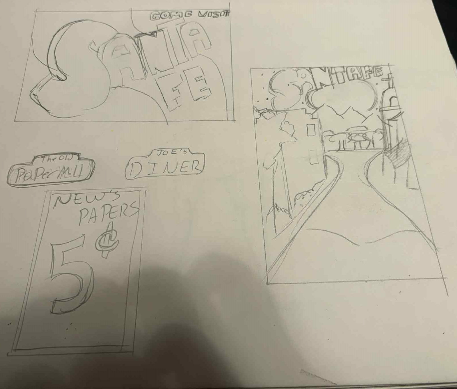
Another concept I explored for Newsies was using the iconic street signs of early New York City as visual storytelling devices. Some signs would have served as period appropriate advertisements that reinforced the world of the play, while others would have represented specific locations such as The Old Paper Mill or Joe's Diner. As scenes changed, a spotlight would isolate a particular sign, instantly establishing where the next moment in the story was taking place.
Not every sign needed to be literal. Some were intended to be symbolic, such as a vintage travel poster advertising Santa Fe. Rather than simply identifying a location, these pieces would have reflected the dreams, hopes, and motivations of the characters, allowing the scenery to participate in the storytelling alongside the performers.
Although this idea ultimately remained on the drawing board due to time and production constraints, it is still one of my favorite concepts from the design process. Had I been able to work alongside the production team in person, I would have loved to bring this layer of visual storytelling to life. It is an idea I hope to revisit in a future production of Newsies or another show where scenic details can help tell the story as powerfully as the actors themselves.
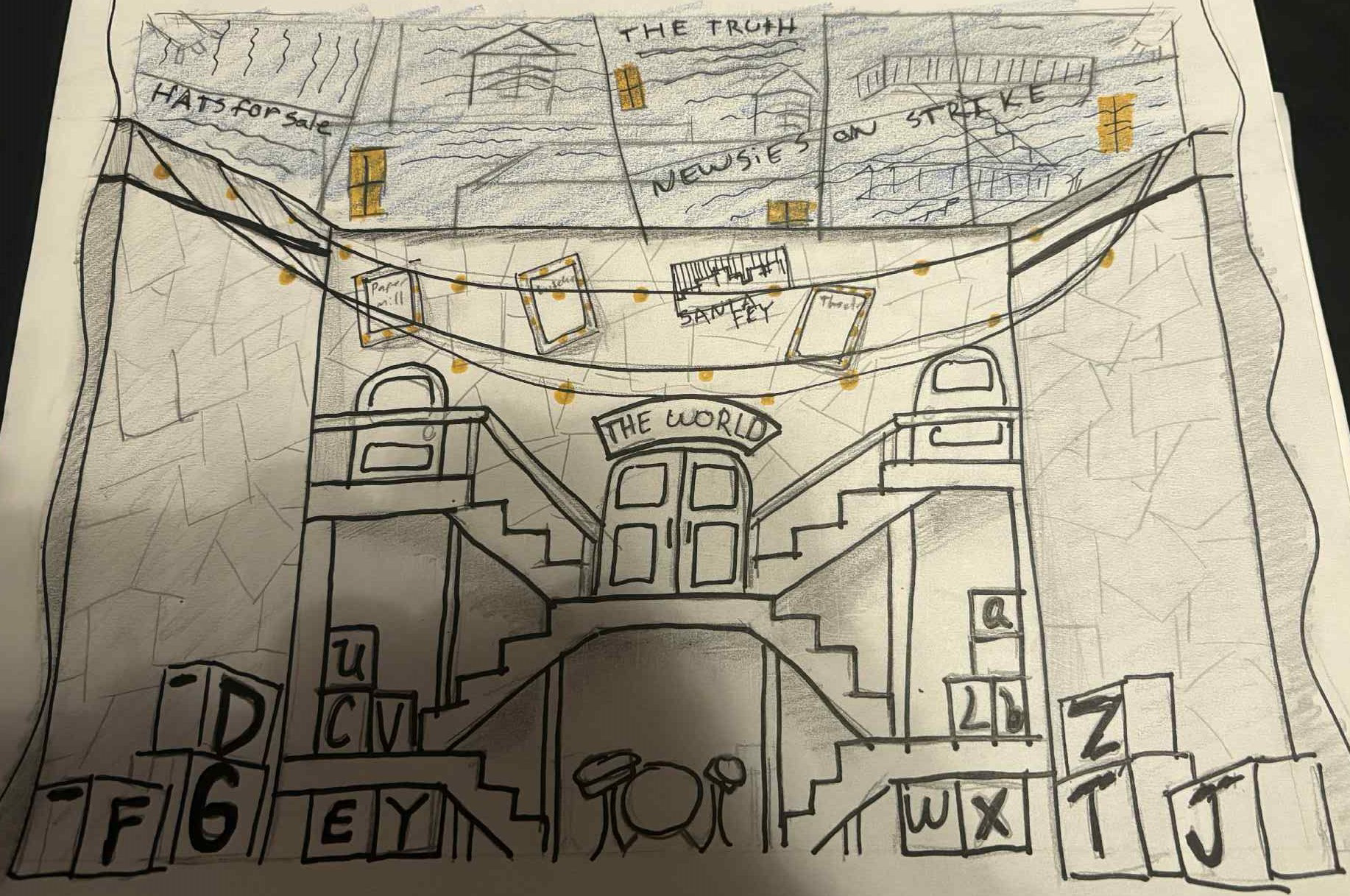
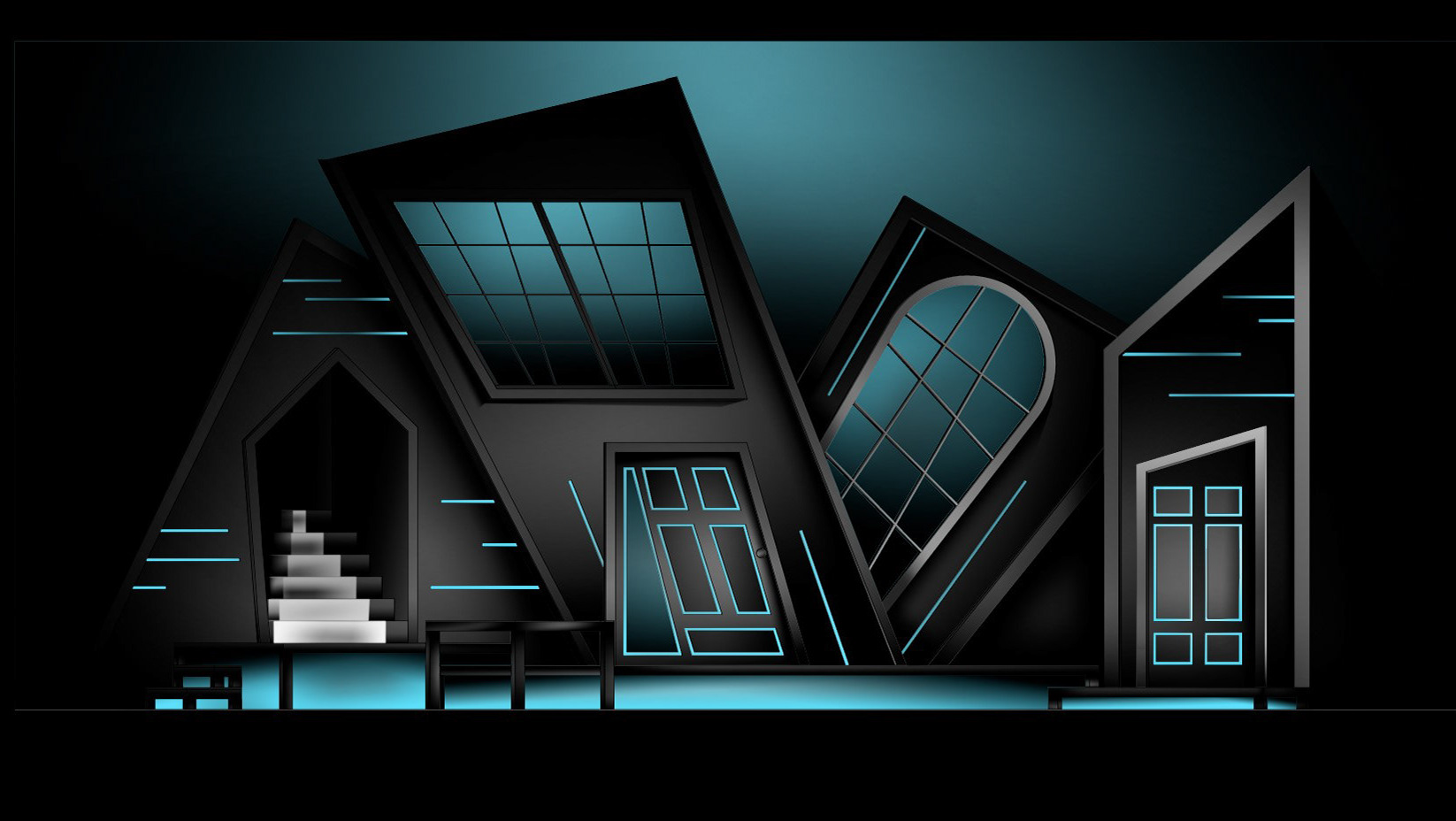
This was the final concept render I submitted for the production. While it may not have been the most polished or traditional scenic rendering, it successfully communicated the visual language, composition, and overall feeling I wanted the set to achieve. Once the technical drawings were completed, the production team had a clear understanding of how to bring the design from concept to reality.
One of the major design motifs carried throughout the set was the use of newspaper typography. Inspired by the visual language of old print media, I envisioned the wooden boxes used as tables, chairs, and performance spaces being marked with vintage newspaper lettering. Words such as "Strike," "Santa Fe," or even larger thematic ideas like "The World" would become part of the environment, turning functional scenic pieces into storytelling elements.
As the design developed, additional details were incorporated to expand the world of the stage. The side walls grew to include elements such as scaffolding and additional doorways, providing more opportunities for entrances, exits, and movement while reinforcing the industrial atmosphere of the city.
At the heart of the design was the central crossroads of the set, a visual meeting point that connected every doorway, pathway, and the window that revealed the musicians. This space became the focal point of the world, bringing together the performers, the city, and the story itself.
While there is a significant difference between this original render and the final production, that evolution is one of the most rewarding parts of the design process. The journey from the first sketch to the finished stage reflects the collaboration, problem solving, and creativity that ultimately shaped the final production.